I was asked to design and manage the build of a booth that we placed within The Assembly nightclub. It needed to give life to a dead corner of the club and fit into the existing interior. Another very important factor was the acoustics - the intention is to broadcast 24 hours a day, so when there's a gig on the main stage just about 3 metres away, the DJ's should still be able to do their job. With one of the biggest, baddest, loudest sound-systems in the city this was quite some challenge. So we designed a box within a box trying to acoustically and physically separate the interior from the surroundings. A lot of the design is within the walls creating a simple, functional and neat-looking box. Two large windows create a visual appeal to the public.
studio 004
This is a blog about work produced by Studio 004. A Cape Town based design studio founded by Oliver van Maasdijk in 2011.
Thursday, 5 July 2012
ASSEMBLY RADIO
The iconic Cape Town live music venue The Assembly has teamed up with For music Lovers to produce a new local internet radio station. They will play music that is not usually heard on the radio... more rock, more acoustic and less commercial.
I was asked to design and manage the build of a booth that we placed within The Assembly nightclub. It needed to give life to a dead corner of the club and fit into the existing interior. Another very important factor was the acoustics - the intention is to broadcast 24 hours a day, so when there's a gig on the main stage just about 3 metres away, the DJ's should still be able to do their job. With one of the biggest, baddest, loudest sound-systems in the city this was quite some challenge. So we designed a box within a box trying to acoustically and physically separate the interior from the surroundings. A lot of the design is within the walls creating a simple, functional and neat-looking box. Two large windows create a visual appeal to the public.
I was asked to design and manage the build of a booth that we placed within The Assembly nightclub. It needed to give life to a dead corner of the club and fit into the existing interior. Another very important factor was the acoustics - the intention is to broadcast 24 hours a day, so when there's a gig on the main stage just about 3 metres away, the DJ's should still be able to do their job. With one of the biggest, baddest, loudest sound-systems in the city this was quite some challenge. So we designed a box within a box trying to acoustically and physically separate the interior from the surroundings. A lot of the design is within the walls creating a simple, functional and neat-looking box. Two large windows create a visual appeal to the public.
Friday, 20 April 2012
LUSSO
Lusso is a new brand developed in South Africa that imports exclusive designer furniture and crockery from Europe. A floor in a building in the centre of Cape Town was chosen for the location of the showroom.
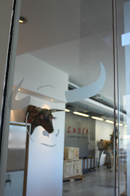
The concept was to have a museum-type feel combined with a hot-off-the-press warehouse feel. Crates were made up and placed within the space with the lids pried open to expose various pieces. This implied that the goods had just come off the boat (and hence from afar) and that the potential clients were the first to have a glimpse at this new ware. The space was kept relatively bare with an industrial screed floor, smooth walls and temporary walls as in a museum. The whole was to have a rather temporary, pop-up character to it and let the products to the talking.
Thursday, 8 December 2011
G-STAR SANDTON
In November 2011 the second G-Star Raw store was opened in Sandton, Johannesburg. Together with the local owner the design concept from Amsterdam was adapted to suit the local market. I was asked to take on the project management and to have certain furniture fixtures produced locally.
Thursday, 10 November 2011
YOGIBERRI
It was a joint venture by the Spar and Yogiberri that saw the realization of a frozen yoghurt stand in the Cape Quarter. The concept was frozen joghurt mixed with fresh fruit and berries. The colours were white and pink and green and it had to fit into the existing structure.
Wednesday, 12 October 2011
JAKURA SUSHI BAR
Jakura was to be a Japanese-looking sushi bar in Canal Walk. The setting was a fairly complicated location around the escalators in the food court. It needed to have an open character yet the patrons needed to feel closed-off from the rest of the bustling area. The largest sushi-belt in Cape Town was wrapped around the escalator and the kitchen was placed below the escalator thereby maximizing a very limited space.
Thursday, 19 May 2011
FABIANI
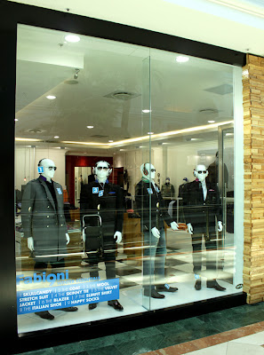
Fabiani asked me to take their store in Willowbridge and, although reusing as much furniture as possible, to create a new concept for Fabiani to implement in Canal Walk and possibly countrywide. Fabiani is a brand with much to offer. The extensive exclusive collection provides the client with a lot to choose from. However this is also often the problem – too much choice. I decided to simplify the task for the customer by creating clarity, allowing customers to read the store upon entering. Furniture against the walls has remained sparse leaving room for Fabiani’s core products: G-Star denims and clothing, Fabiani shirts, Fabiani Suits and Fabiani shoes. The central floor space is more chaotic, enhanced by a classic black-and-white checker tiled floor, enticing the customer with abundance.
The amount of materials and colours used within the store has also been reduced allowing the product – clothing – to do its work. Tones of white have been layered creating a chic ton-sur-ton effect. This subtleness enhances the fine quality of the brand without distracting. The copper and wooden materials add warmth to the interior while keeping it masculine. Much of the wood has been treated with a thick epoxy coating, giving a surprising texture to a well-known material.
HOUSE OF PERFORMANCE
In 2006 a consultancy firm in Utrecht, The Netherlands, acquired the old courthouse in the city centre. In collaboration with the newly-founded design firm Kuub, the interior was transformed.
As most employees worked from clients' offices Monday through Thursday, the solution for the interior had to ensure that the large rooms didn't feel too empty. A 'meandering' desk was chosen as the solution. This filled the space and could be used for up to 15 people to work at, but didn't create the idea of vacant desks when only two people were sitting at it. The materials chosen for the surfaces was predominantly solid oak laid in a herringbone structure, giving a modern application to a traditional material. The feel of the more than 150-year-old building needed to be upheld while at the same time portraying the feel of a modern and innovative company. High quality materials and workmanship were used to further exude these characteristics.
Subscribe to:
Comments (Atom)


